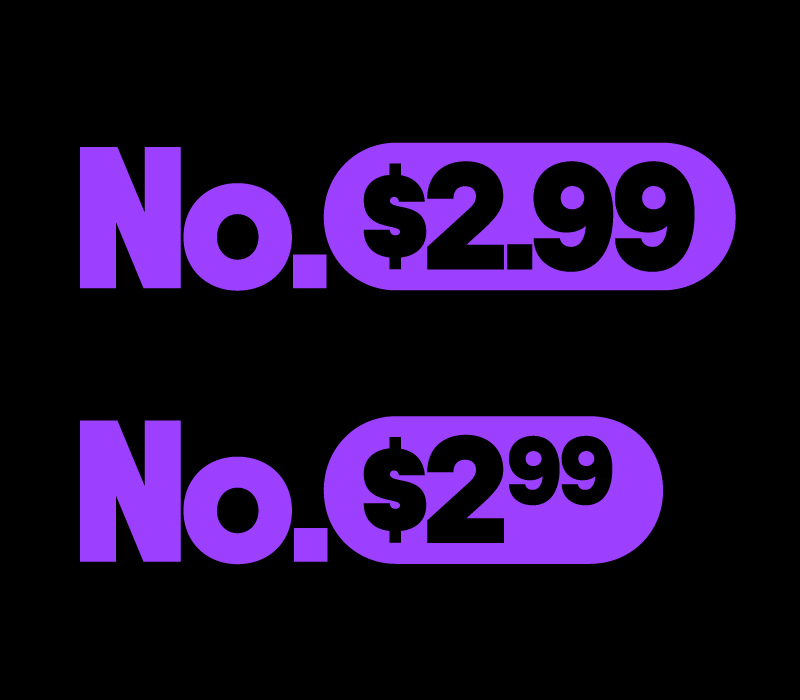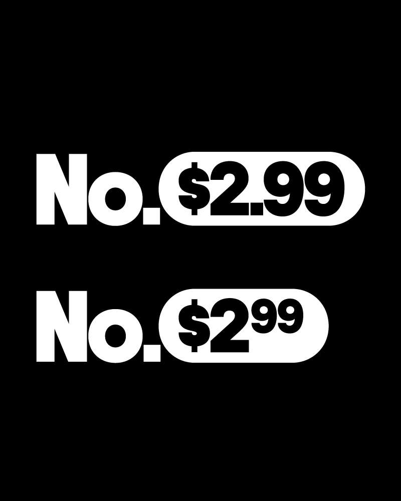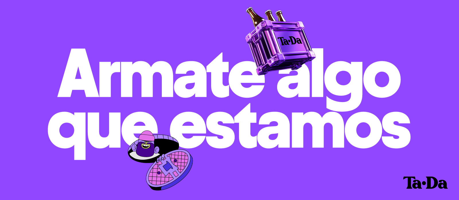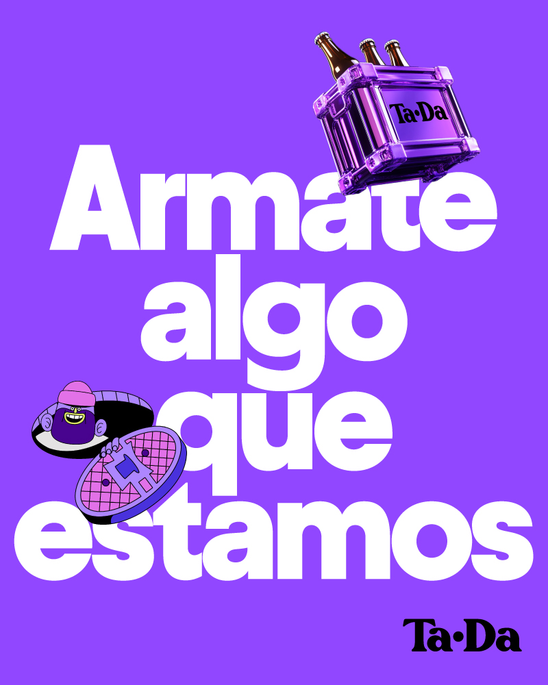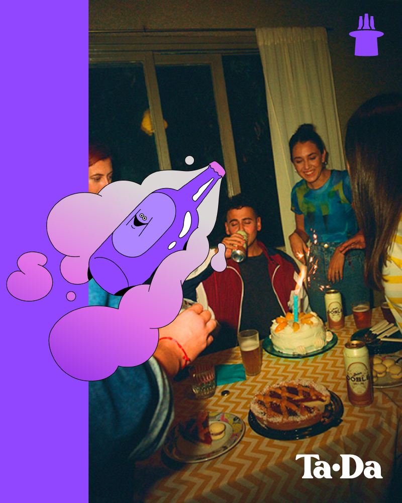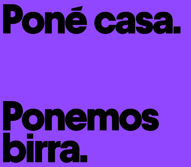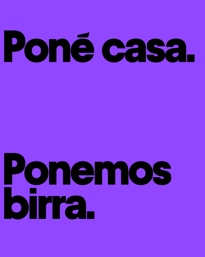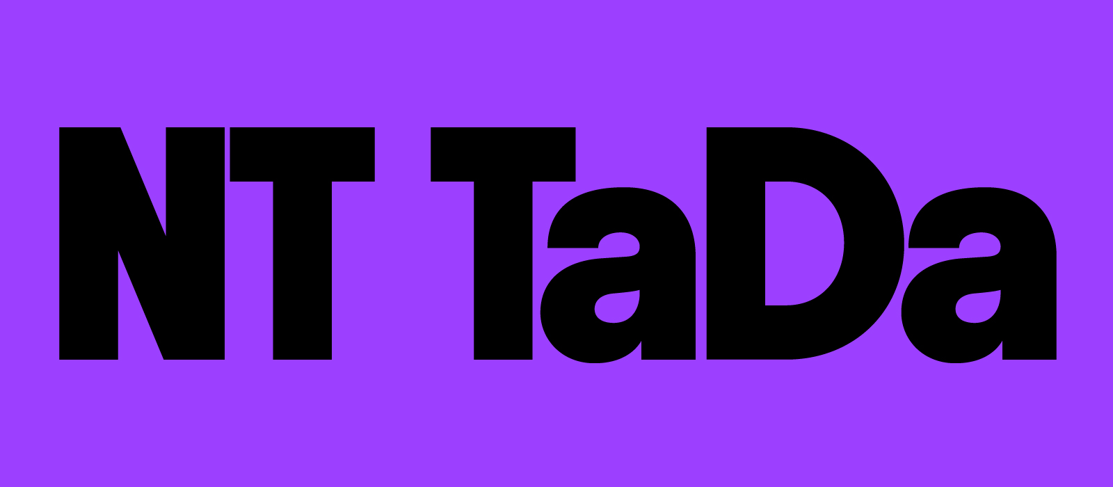
This typeface is conceived as a versatile system with strong visual impact, designed to adapt to diverse communication needs through its four weights —Regular, Medium, Bold, and Extrabold—.
Its geometric structure, balanced proportions, and precise spacing provide clarity and strength at every scale, from functional text to large-format headlines. Regular delivers a sober, neutral voice, ideal for continuous reading; Medium adds presence and solidity without sacrificing legibility; Bold reinforces character and visual hierarchy; while Extrabold reaches its peak of strength, dominating the space with graphic authority.
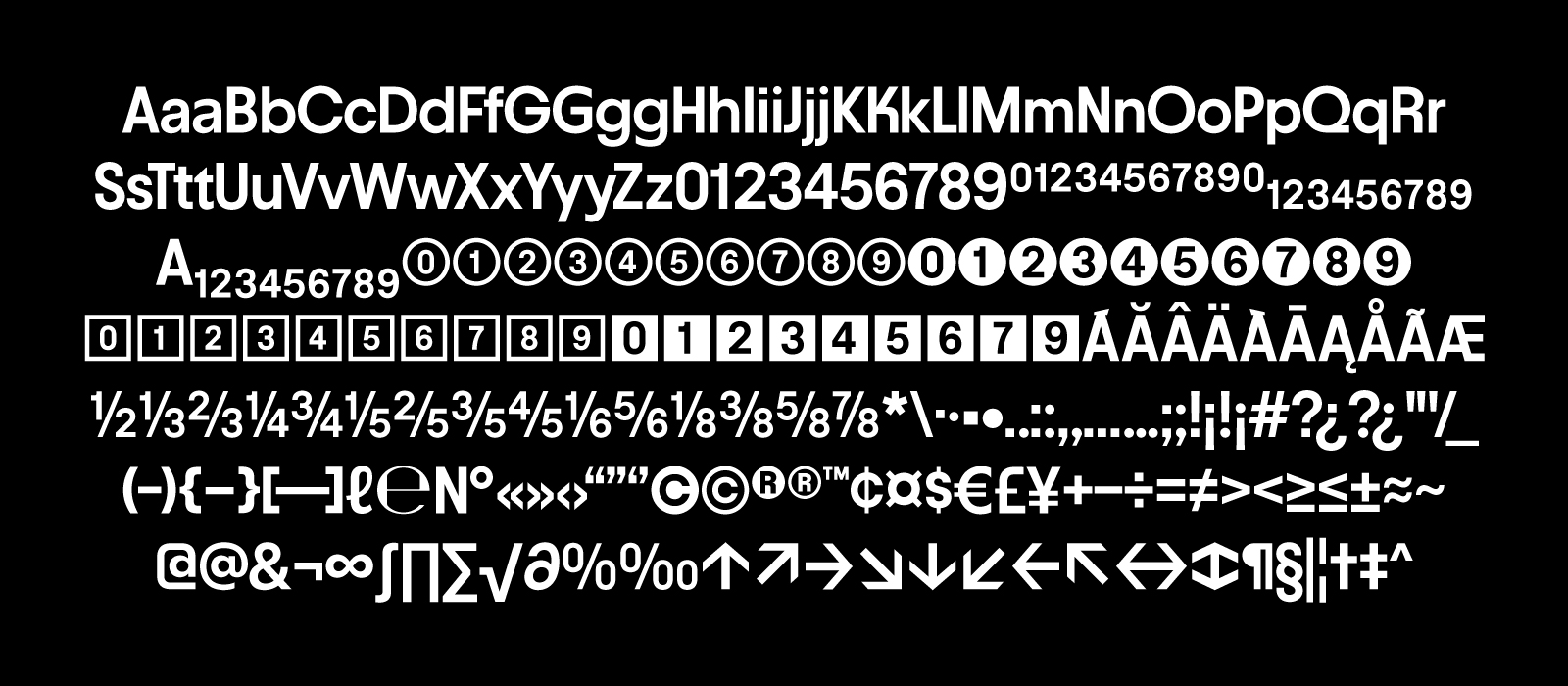
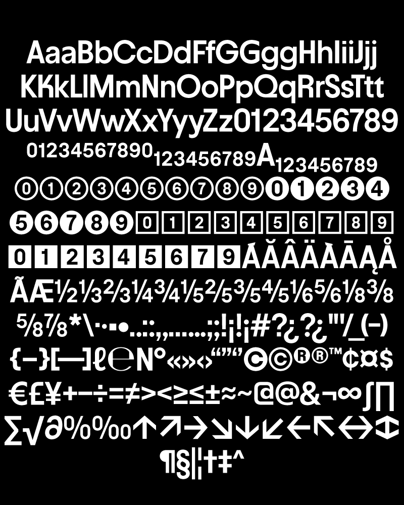
The extensive glyph set —including numerals, symbols, and alternates— broadens its range of applications, making it a powerful tool for both editorial design and contemporary visual identity.
Agency: RG/A