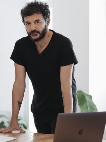
About

Typography is a vessel. 
It is the visual conductor for language, 
one that reaches far beyond mere words 
and their meaning. It is the art of shape, craft, design & convergence, 
all within a set of characters that conveys 
a specific essence. Type is the possibility of finding intention in each letterform, throughout the world’s endless pursuit of expression. Typography transforms words into a potency to be 
read, written, looked at, indulged in, showcased 
and so on- 
it is the basis from which identity grows into its entirety. 


At Nodo, we continue the legacy of typography by knowing its place is front and center.

 There is power in knowledge and we know, 
first of all, type is infrastructure.


Nodo Type Foundry was created in 2015 by Ariel Di Lisio (Arg) and Aldo Arillo (Mx) and currently operates globally whilst holding offices in each of the founders’ native cities – 
Buenos Aires & Monterrey.

The foundry specializes in the creation of retail fonts and custom type services that take forward-thinking brands and agencies to their desired level of visual identity. 


Ariel Di Lisio

During his childhood, Di Lisio spent his time flipping through magazines and staring at street posters, his attention fixed on the form of letters, the details of each character. 


The foretelling of an unnamed yet known at-first-sight romance with typography that ensued.


Di Lisio earned a BA in Graphic Design from University of Buenos Aires and then worked from 1993-1997 in Puma. In 2009 his work was  selected for the Lubalin Now Exhibition Center of Design and Typography at Cooper Union, NY.


A recurrent guest professor at CEDIM and UDEM in Monterrey, since 2015 he’s a faculty member of FADU-UBA’s Branding Graduate Program.

Aldo Arillo

Growing up in the Northern Mexico desert, Arillo refuged himself from the heat in his father’s studio, gazing at books, piling them up. Instead of taking up writing like his father, he was transfixed by the letterforms imprint on the books’ covers, carrying out a continuous trace of each of their forms.


In 2012 Arillo earned a BA in Graphic Communication at CEDIM graduating SummaCum Laude, pursuing soon afterwards his MA in Typography at FADU-UBA in Argentina. 


He has been a speaker at Tipografía México,  Typostammtisch Berlin and Typecon and is currently part of the Typography and Architecture faculty at his alma mater. His typographic studies, displays and innovations have been part of institutional exhibitions such as Museo MARCO and Museo Franz Mayer.

Do you want us to develop your typeface?

Send us an email

Conferences & Lectures

  • Lorem Ipsum Dolor Sit

    2009

    BA, Argentina

Exhibition & Press

  • I.D. MAGAZINE — 40 BRIGHT, YOUNG INTERNATIONAL DESIGNERS

    USA

  • IDN MAGAZINE — GLITCH ISSUE

    HONG KONG

  • NOVUM — TYPOGRAPHY

    GERMANY

  • LOS LOGOS COMPASS — GESTALTEN

    GERMANY

  • LOGO DESIGN No.3 — TASCHEN

    GERMANY

  • LATINO GRAFICO — GESTALTEN

    GERMANY

  • LATIN AMERICAN GRAPHIC DESIGN — TASCHEN

    USA

  • COMPUTER ARTS ISSUE #135, LOGO ISSUE

    USA

  • GOPHER ILLUSTRATED, LOGO ISSUE

    USA

  • TYPO LYRICS — SLANTED

    NETHERLANDS

  • LOGO DESIGN No.2 — TASCHEN

    GERMANY

  • LOGOLOGY — VICTIONARY

    HONG KONG

  • RETRO DESIGN IN CONTEMPORARY GRAPHICS

    USA

  • YOUNG GRAPHIC DESIGNERS AMERICAS — DAAB

    GERMANY

  • COMPUTER ARTS ISSUE #179, VIVA ARGENTINA!

    USA

  • COMPUTER ARTS ISSUE #154, GET INSPIRED!

    USA

  • FLORA Y FAUNA — VICTIONARY

    HONG KONG

Clients & Agencies

  • Wieden+Kennedy

  • Timberland

  • ©Cedim

  • Porto Rocha

  • ZARA

  • Museo Marco

  • Museo Tamayo

  • Johnnie Walker

  • Penguin Random House

  • Discovery Channel

  • Tec de Monterrey

Credits

  • Website Development

    Raidho

  • Website Design

    Ana Despress